Political, Physical and Thematic Maps Explained
A border post, a contour line and a shaded county boundary can all appear on the same sheet of paper, yet they answer entirely different questions. Pick up the wrong map and you will spend an afternoon looking for a mountain that was never drawn.
Maps divide into three working families: political, physical and thematic. Knowing which family you are holding — and, just as importantly, which one you are not — saves time whether you are revising for a geography exam, planning a long walk or trying to settle an argument about where a boundary runs.
The three families at a glance
- Political maps show human organisation: countries, borders, capitals, regions and administrative areas.
- Physical maps show natural form: relief, rivers, coastlines, geology and sea depth.
- Thematic maps show a single subject — rainfall, population, traffic, land use — laid over a base map.
Most atlases are hybrids: a physical base with political lines printed on top. That is convenient, but it can disguise the fact that the two layers were drawn at different times from different sources.
Political maps: who governs where
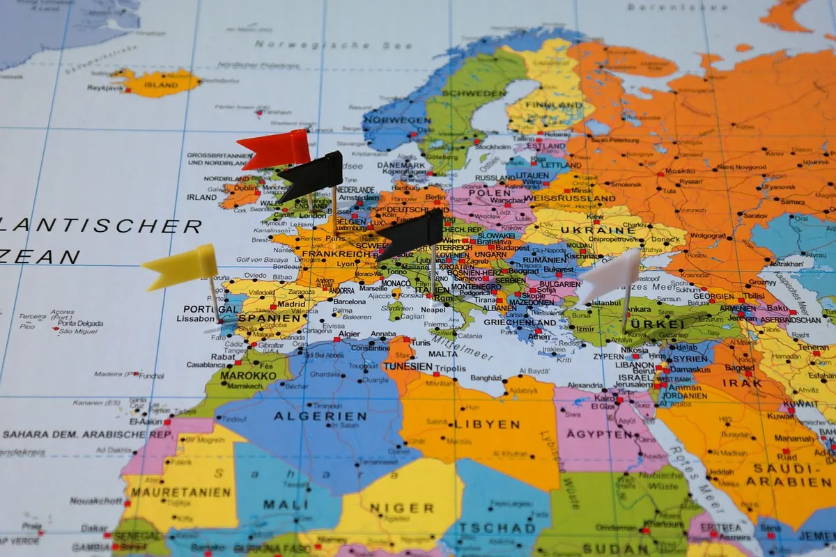
Political maps are about jurisdiction. They show national borders, state and county lines, capital cities and the names of administrative units. Line style carries meaning. A solid line usually marks an agreed international boundary; a dashed line often suggests a disputed, undefined or unratified one; a faint grey line is more likely a council or constituency boundary that matters enormously at election time and not at all when you are hiking.
The weakness of political maps is time. They age. South Sudan became independent in 2011, and Yugoslavia broke into several states during the 1990s. A wall map printed before either event is now a historical document rather than a reference. Before relying on one, find the publication date and check whether a revised edition exists.
Scale matters too. On a world political map, small states and island nations are often labelled with leader lines or left off entirely, and complex river boundaries are simplified into tidy straight lines. If the exact line matters, go to a national mapping agency rather than a wall chart.
Physical maps: reading the shape of the land
Physical maps describe terrain. Relief usually appears in one of three ways: contour lines, layer tints (green for low ground, brown and white for high ground), and hillshading that mimics low-angle sunlight. Spot heights give the elevation of a single point, while trig pillars and benchmarks mark surveyed positions.
Contours are the part worth practising. Each line joins points of equal height, and the vertical gap between lines is the contour interval — commonly 5 or 10 metres on British walking maps. Lines packed close together mean steep ground; widely spaced lines mean gentle slopes. Where contours form a V, the point of the V aims uphill, which is how you spot a valley on a flat piece of paper.
Physical maps also cover the sea. Bathymetric tints and depth contours reveal continental shelves, trenches and mid-ocean ridges — which is why an ocean floor map looks like a different planet from a road atlas.
Thematic maps: one subject, drawn well
A thematic map takes a base — political, physical or a plain outline — and adds data. The technique matters as much as the numbers, because each method flatters some patterns and hides others.
- Choropleth: areas shaded by value, usually by administrative unit. Excellent for rates such as population density, poor at showing variation inside a large region.
- Dot density: each dot stands for a fixed number of things. Effective for livestock, housing or disease cases, and it exposes clusters a choropleth smooths away.
- Proportional symbols: circles or bars sized by value. Useful for totals such as city populations, though readers consistently underestimate the area of large circles.
- Isoline: lines joining points of equal value — isobars on a weather chart, isotherms for temperature, contours for height.
- Flow lines: arrows with width scaled to volume, as in migration, trade or shipping maps.
- Cartogram: the map is distorted so that area reflects data rather than land. Sobering for election results, striking for GDP.
A choropleth tells you which authority has the highest rate; a dot map tells you where people actually live.
John Snow's 1854 cholera map of Soho, with dots clustered around a single water pump, remains the classic demonstration of how much a well-chosen technique can reveal.
Scale and projection: the fine print that changes everything
Two numbers decide what a map can honestly show you.
Scale. At 1:50,000, one centimetre on paper covers 500 metres on the ground — a sensible compromise for a day's cycling. At 1:25,000, one centimetre covers 250 metres, so field boundaries, footpaths and walls become legible. Anything smaller than roughly 1:250,000 is for route planning, not for finding a gate.
Projection. Flattening a sphere always distorts something: shape, area, distance or direction. The Mercator projection preserves angles, which is why it suits navigation, but it stretches high latitudes so severely that Greenland appears comparable in size to Africa when it is roughly fourteen times smaller. Web maps inherit that distortion. Fine for finding a street; misleading for comparing countries.
Matching the map to the job
A short routine before you open anything:
- Write your question in one sentence. "Where does the boundary run?" is political. "How steep is the last kilometre?" is physical. "Which areas have the fewest services?" is thematic.
- Fix the area and the scale. Too small and detail vanishes; too large and you will be unfolding sheets on a windy hillside.
- Check the date on every layer, not just the publication year.
- Identify the base map. It shows what the cartographer considered background — and therefore what you should not read too much into.
- Read the legend properly, including units, class breaks and any note about missing data.
- Cross-check with a second source whenever a decision depends on it.
Putting the three together
Real tasks rarely need just one map. Planning a weekend in the Peak District might involve an Explorer sheet for paths, walls and contours, a weather chart with isobars for wind direction, and a land-use or access map to check where you may legally walk. Planning a trip abroad might combine a political map for borders and capitals, a physical map to judge terrain between two towns, and a thematic map of transport links to decide whether the train or the bus makes more sense.
Before you trust a map
Choose by question, then check by date. Political maps answer "who governs here?"; physical maps answer "what is the land like?"; thematic maps answer "how does one thing vary across this area?" If a map cannot tell you which family it belongs to, treat it as decoration.
For navigation, use current sheets from the national mapping agency. For statistics, use the publishing body's own portal and read the methodology note. Where a boundary decision has legal or financial consequences — land ownership, planning or rights of way — check the official record held by the relevant authority rather than a general map, and take professional advice if the outcome matters.
Finally, keep a paper map within reach. Screens are superb at telling you where you are and poor at showing you where you are in relation to everything else.
Photo: Marina Leonova / Pexels