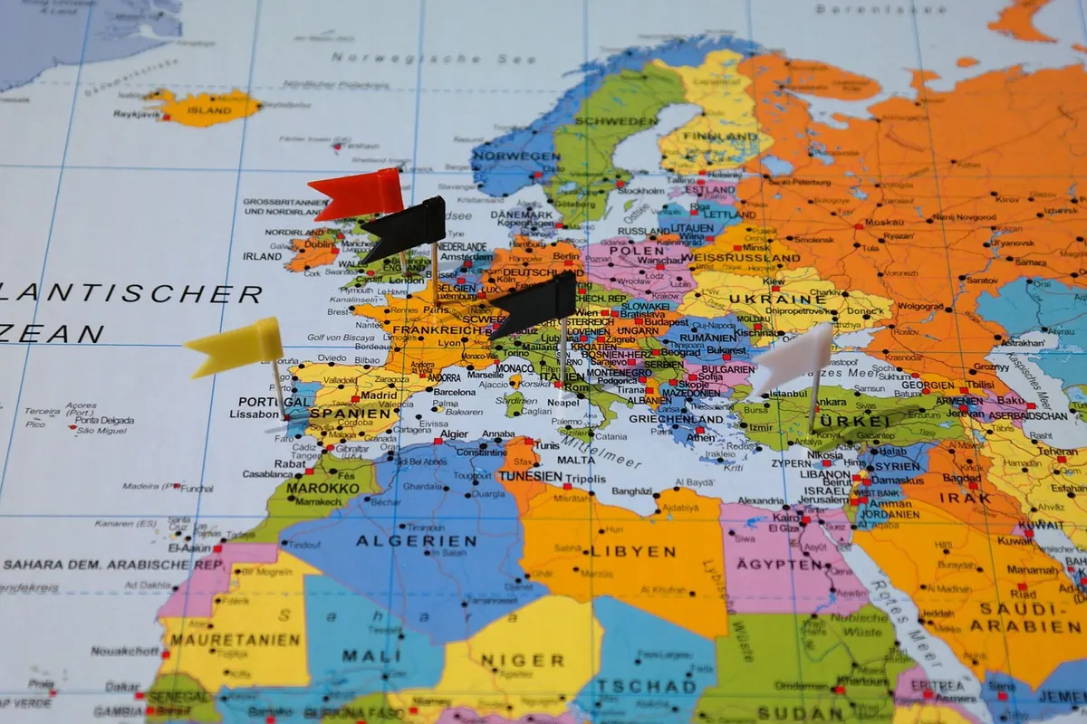
Map Projections Explained: Why Every Flat Map Distorts the World
Peel an orange and try to press the skin flat against the table. It splits, or it stretches, or it does both. Every flat world map is somebody's decision about which kind of damage is acceptable. The globe on your shelf shows Greenland as a large but modest island; the map on the classroom wall shows it swelling towards the size of Africa. Neither is a printing error. They are different projections, and each one is making a bargain.
Understanding those bargains is worth ten minutes, because it changes what you can trust a map for — including the one on your phone.
Why a sphere will not lie flat
A projection is a set of rules for turning positions on a curved surface into positions on a flat one. Latitude and longitude describe where you are on the globe; the projection decides where that point lands on the page. Because a sphere curves in two directions at once and paper does not curve at all, some of the geometry has to be sacrificed. Mathematicians settled this long ago: a curved surface cannot be flattened without distortion. There is no clever trick waiting to be discovered.
So the useful question is never "which map is accurate?" It is "which distortion can I live with for this job?"
Four properties, and you cannot keep all of them
Most projections are built to protect one or two of the following, and let the rest slide.
- Shape (conformal): small features keep their correct angles and outlines. A lake, a coastline, a city block looks right. Areas, however, can be wildly wrong.
- Area (equal-area): every region is shown at the same scale relative to every other. Shapes get stretched into odd, elongated forms.
- Distance: a few projections keep distances true from one point, or along particular lines. No world map keeps every distance true everywhere.
- Direction: some keep compass bearings straight and reliable, which matters enormously at sea and hardly at all on a rainfall map.
You will also see the word compromise. That is not a fudge. It is a deliberate brief: keep every distortion small rather than driving one distortion down to zero.
Mercator: superb at sea, misleading on the wall
Gerardus Mercator published his projection in 1569, and it solved a genuine problem for sailors. On a Mercator chart, a line of constant compass bearing — a rhumb line — appears as a straight line. You could draw a straight course from Lisbon to the Caribbean and follow it without recalculating your heading. Angles are preserved, so a bearing measured on the chart matches the bearing on deck.
The cost is area. Mercator stretches the map further and further as you move away from the equator, and the stretching applies north–south and east–west together, so the exaggeration compounds. Africa covers roughly thirty million square kilometres; Greenland covers a bit over two. On a Mercator world map the two can look like near neighbours in size.
Spotting Mercator at a glance
Meridians are evenly spaced vertical lines. Parallels are horizontal lines that get further and further apart as you head towards the poles. Antarctica becomes a smear along the bottom edge. See those three things together and you are almost certainly looking at Mercator.
The version used by most online mapping services — often called Web Mercator — is the same idea adapted for square map tiles. It is excellent for street-level browsing and route finding, and a poor choice for a world map of population, forest cover or anything else where the size of a country matters.
Equal-area projections: when the question is "how much?"
Equal-area projections keep the ratio between areas correct. Double the area on the map and you have doubled the area on the ground. Anything that shades countries by a number — people per square kilometre, hectares of wheat, votes cast — should use one.
Mollweide and the cylindrical equal-area family are common choices for global data. Albers conic equal-area suits a single mid-latitude country that is wider east-to-west than north-to-south, which is why it feels so familiar on maps of the United States and Europe. Lambert azimuthal equal-area works well for polar regions, where Mercator simply gives up.
The trade-off is shape. Drop a set of equal-area circles onto a globe — Tissot's indicatrix is the standard tool for this — and you watch them turn into ellipses of the same area but different proportions. Near the edges of a Mollweide world map, continents look as though they have been pressed sideways. That is the price of honest area.
Compromise projections: the sensible middle
Compromise projections accept a small error everywhere instead of a large error somewhere. Robinson, published in 1963, was designed for general world reference maps. Winkel Tripel, older but adopted by National Geographic for its world maps from 1998, reduces distortion of area, direction and distance at once. Natural Earth, drawn up more recently with cartography rather than navigation in mind, does something similar with a gentler look.
None of them will give you a reliable route across an ocean, and none will give you exact area comparisons. For a wall map, an atlas plate or a diagram in a report, they are usually the right answer, because the reader's eye is doing rough work rather than measurement.
Choosing one: a short routine
- Name the job. Navigation, area comparison, or general orientation? That single answer eliminates most options.
- Match the extent. A city plan, a country and the whole world are different problems. For a small area, any sensible projection is close to indistinguishable.
- Protect the property you need. Sizes matter, so use equal-area. Bearings matter, so use a conformal projection such as Mercator. Neither dominates, so use a compromise.
- Read the graticule. The pattern of meridians and parallels tells you a great deal about what the projection is doing before you read a single label.
- Label it. If you make a map, put the projection name in the corner. It is the equivalent of citing a source, and it takes four words.
Building the habit
Next time you open a map, spend a few seconds on the credit line in the corner. Most published maps name their projection there, and commercial web maps bury theirs in the documentation. Once you know whether you are looking at Mercator, an equal-area projection or a compromise, you know what you can read off the map and what you should not.
For everyday use, that is enough. Check a route on a phone map and the projection barely matters, because at street scale the errors are smaller than the width of the road. Compare the size of two countries, plan a flight path, or colour a world map by any kind of data, and it matters a great deal. Keep one equal-area world map and one Mercator world map to hand and you will rarely be caught out.
If you want to see the distortion for yourself, put a globe and a wall map of the world side by side. Greenland tells the story better than any explanation.
Photo: Beate Vogl / Pexels